OUR DESIGN PRINCIPLE
The RUAG design principle is consistently derived from the RUAG logo. It forms the visual framework and a system for the design of all company media.
The RUAG element renders the dynamic quality of the RUAG logo into a design imagery and ensures a recognisable, distinctive and consistent brand look. The RUAG element is the bearer of both the brand logo and text information.
RUAG element - formal derivation
The idea of the "Stable agility" logo is transposed to the design principle: the "RUAG element" is consistently derived from the figurative mark and is the element that influences the style of the corporate design.
The RUAG element essentially serves as the platform for the brand logo.
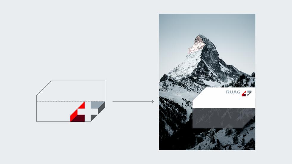
The RUAG element design principle
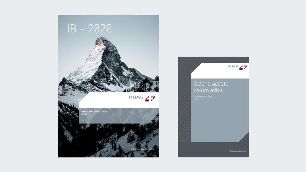
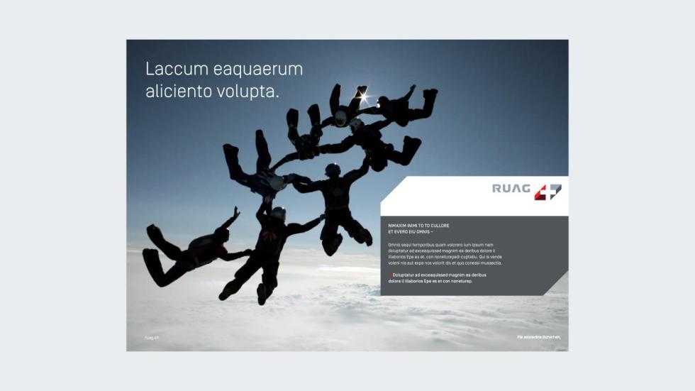
The RUAG element is used on title pages, displays or other eye-catching communication media. On the inside pages of media, in contrast, it does not appear at all, or only in a reduced form.
RUAG element and RUAG logo
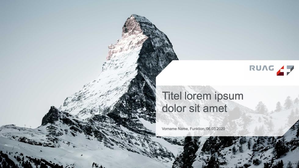
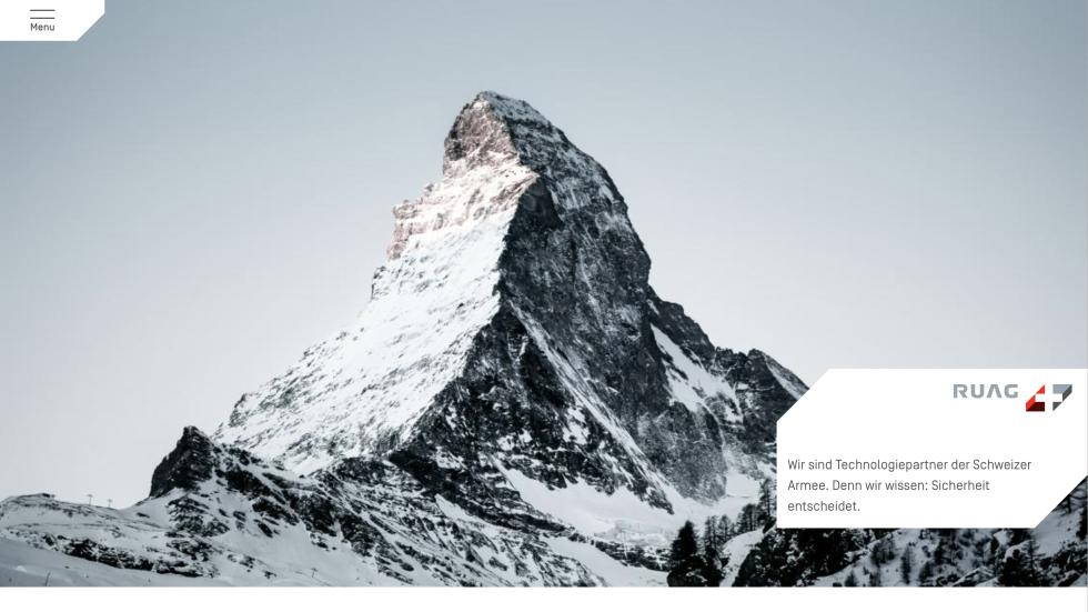
Whenever the RUAG element is used, the RUAG logo is positioned to the top right on the element. If there is text information on the RUAG element, then it is positioned on the lower part of the element.
RUAG element and text
Normally, the RUAG element is the bearer of subheadlines and short running texts. Headlines are placed outside the element. If a small and single-piece element is used, then it can only contain the logo. If it is large, then it can be accompanied by headlines and long running texts.

with subheadline
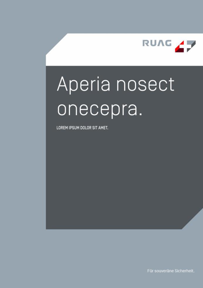
with headline and subheadline
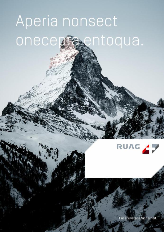
without text
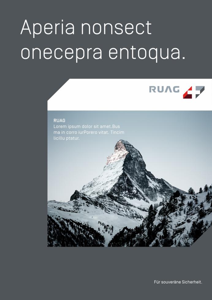
with subheadline and running text
RUAG element – application
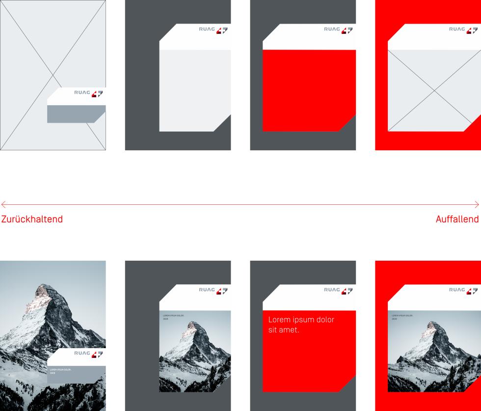
The element's high degree of flexibility and diverse usage options guarantee a lively appearance as well high recognisability and consistency. The flexible usage enables customised visual orientation for the various media – from restrained to eye-catching.
RUAG element - colour, filling
The RUAG element can be used with one colour, two colours or with an image motif.
Single-coloured white version
The lower part can be used with a transparency of 85%. Then text must be placed.
The single-coloured version is essentially white, as the RUAG element is the bearer of the RUAG logo. With RUAG elements, the white version is always used without text.
Two-coloured version
With the two-coloured version, the upper part of the element is essentially white, the lower part can be coloured in RUAG grey, RUAG dark grey and RUAG red. RUAG grey, RUAG dark grey and white can be used with a transparency of 85%.
On the two-coloured version, text must be placed.
Filling with an image motif
When filling with an image motif, it must be ensured that the lower part is sufficiently large in order to guarantee generous, eye-catching use of the motif. Image motifs in the RUAG element cannot be used with any transparency.

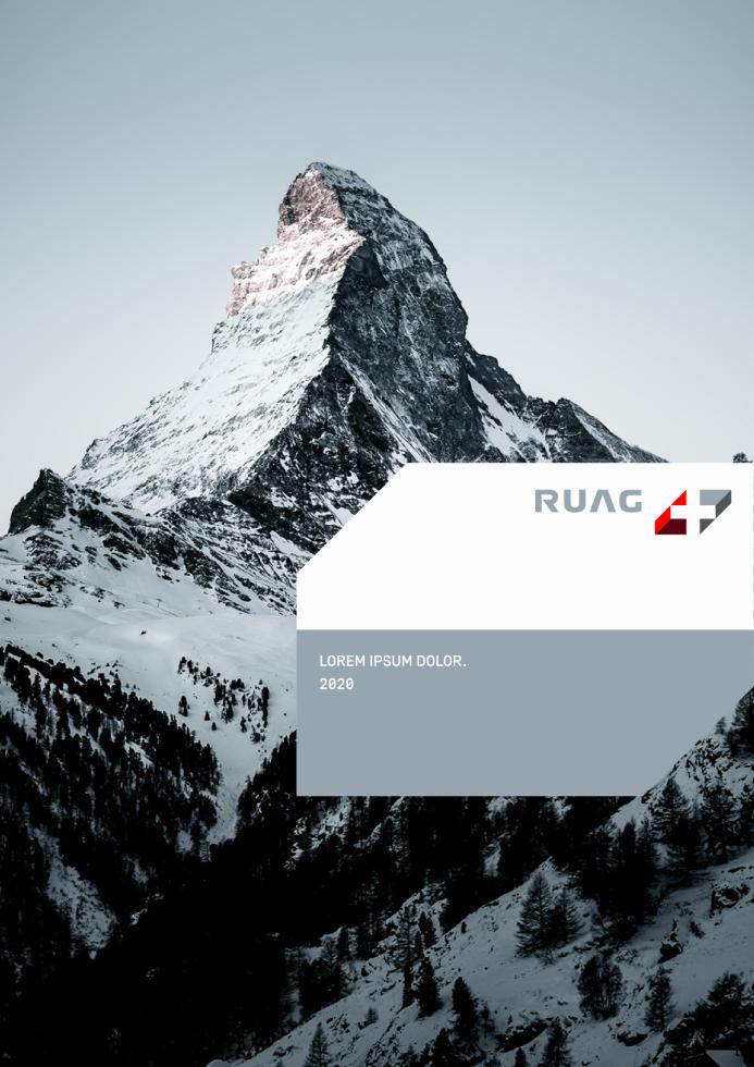


RUAG element – flexibility
The RUAG element is the element with the most influence on RUAG's corporate design. Its flexible usage options guarantee a lively design system with high recognisability through all areas of communication.
According to the requirements for each communication media, the RUAG element can guide the desired visual orientation – from restrained to eye-catching.
Hatching
RUAG hatching is a decorative design element. It can be used both in image motifs and on surfaces. It is used in white (70% opacity – already set up in the file) and in RUAG grey with a line strength of 0.4 pt.
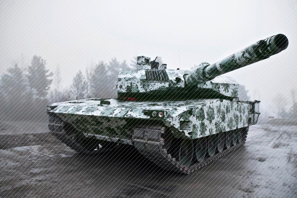
File: RUAG_Schraffur_Weiss.eps

File: RUAG_Schraffur_Grau.eps

File: RUAG_Schraffur_Grau.eps

File: RUAG_Schraffur_Weiss.eps
Download design principle
Here you will find more in-depth information.